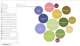
While searching for some new tools to use to analyze big
data I recently found one called “Many Eyes.” This program offers several different
visualization techniques that I found to be very interesting. Not only does
this program offer numerous ways to analyze big data but it also has hundreds
of data sets that are already loaded into Many Eyes. This will allow you to
play around if you just want to try it out. This is an IBM program that is free to use which is rare on something that does so many different things.
I am
going to just point out some of the different types of visualizations that can
be done using this great tool. The first two are of vehicles fatalities in the
United States last year. The first one has it divided up by age and has them
displayed in a pie chart. The Second one is divided up by state and has it
displayed by color differences on a map of the US. This data was already in Many Eyes so anyone can analyze it.
The next visualiztion was done on Instagram data. This kind of analysis could be used on almost any kind of survey to check employee and customer satisfaction on a wide array of topics.
We have already used several different programs that will do word counts and show words linked together but I thought this was a very interesting way of dispaying it. Words that appear more often will appear bolder and larger in font. This will creat a picture that would work great to get your point across in a presentation. It would also make the data a little more interesting to look at compared to powerpoint slide with a spreadsheet on it.
If interested in this software then go to:
I found this to be a great tool and I hope you will too. It is free to use but you will have to register on the programs website.


This tool that Chris Shaw featured in his blog is a great visualization tool. I wanted to explore some more of the features of Many Eyes. There were many visualizations of all kinds that users have already created and uploaded. Browsing these visualizations gives you many ideas of different kinds of visualizations. Chris has pointed out a few different kinds in his original blog post such as pie charts, maps, bubble charts, word count displays. Other interesting types of visualizations include word trees, line graphs, stack graphs, network diagrams, and matrix charts. You can easily find examples of each of these kinds of visualizations on the user created charts on the Many Eyes website.
ReplyDeleteEach type of visualization is suited for specific data. Many Eyes gives some guidelines as to which visualization to choose based on your data set. There are 6 categories of visualizations: relationships among data points, compare a set of values, track rises and falls over time, see the parts of a whole, analyze a text, and see the world.
Another interesting property of Many Eyes is the ability to upload your own data to the website. In order to do this you must register for an account, which is free and easy to do as Chris stated before. The great thing about this is that once you upload the data set, it is available to all users on the website. This is also an important thing to consider before you upload any information that may be personal or confidential. But as long as you are trying to analyze public data, it is a great tool. You can upload the data and allow others to create the visualizations for you. They may think of a new and creative way to display the data that you had not thought of.
The ability to “watch” data sets or visualizations is available to all registered users. This comes in handy when you upload your own data sets. You can put them in your watch list and keep track of all visualizations that are created using the data. You can also include other users’ data sets and visualization on your watch list that you find interesting.
I personally uploaded a data set entitled “MLB Stats for last 10 years” and created a stack graph for categories. This visualization worked out well with my data because the statistics included many different categories and it displayed changes over time. This visualization can be seen on the Many Eyes website by typing in “MLB Stats for last 10 years” in the search bar.
This tool is simple but effective. The fact that it is free to use is a huge bonus. I would encourage everyone to play around with the program as it could be beneficial to use in the future.
Chris and Justin,
ReplyDeleteGreat insights here. Thank you for introducing us to these tools and their application.
Fadel