I want give a brief instruction for creating heat-map using Google Doc/Spreadsheet/Drive by an example
To create heat-map by Google spreadsheet, the first column has to be region names. The region names could be state, county, or city. The other column stores data want to show on map.
My example is to explore the population move in/out Alabama to other state.
First, I obtained my data from: http://www.census.gov/hhes/migration/data/acs/state-to-state.html
Then, download data from year 2005 to 2011. The data is shown in the figure below. The red circled data is needed.
The data includes current states, and previous states, and the number is the population moved form previous state to current state. I will do the example for showing people's destination states moved out from Alabama. The next step is clean this data, in below screenshot is the data before uploaded to Google Drive.
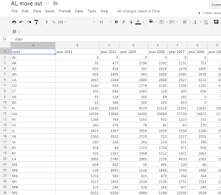
After I uploaded it to Google Drive, it shows in the picture below. Please make sure the first column is state code, such as, AL, AK, not Alabama and Alaska.
The column beside state code is number of people moved to other states, which we want to show on the map.
To create heat-map, I choose "insert" --> "Gadget", shown below.
Then, choose "map" on the left side, and choose "heat-map" in following picture
After add this Gadget, the system will ask to select data range. After enter data range, choose "Region" as U.S.A..
Then, click "apply". The heat-map is shown.
Form this heat-map, we can see most of the population moved out from Alabama in 2011, went to Georgia. Other major destination states are Florida, Texas and Mississippi. The moved in data for Alabama or other states' information could also be got from this way.
As mentioned in the beginning, market share information, education information, election campaign information could also be represented by this tool.


Gang Hao,
ReplyDeleteGreat post. Thank you for sharing. This is a very useful tutorial for many of your colleagues who are working with spatial data.
Fadel
Nice blog... Heatmap analytics help to identify aggregate of engagement across your website's pages and can be split by clicks, taps & scrolling behavior.
ReplyDelete