I have looked further into the visualization of GDP per capita
versus percent GDP spent on military I created earlier in the semester and
wanted to write a quick tutorial on how I altered the Google spreadsheet in
order to focus on African nations and what this chart reveals about that
continent.
The first step was quite simple but time consuming. I had to
go through the data and delete the data on 95 different nations to leave 35
remaining African countries that had sufficient data.
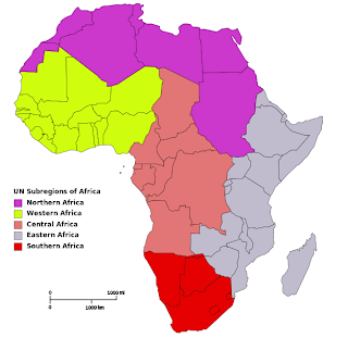
Next I separated the 35
nations into the five UN geographical sub-regions: Northern, Western, Central, Southern,
and Eastern.
After grouping the nations under these regions and gave each
region a numerical value so I could distinguish them by color on the motion
chart.
Northern (1), Western (2), Central (3), Southern (4),
Western (5)
When finished, simply select “Insert”, then “Chart”, “Charts”,
“Trend”, then finally the image of a motion chart to the right of Trend. Select “Insert”
and the chart will be inserted onto your tab containing your data. If you select the
drop box at the upper right hand corner of the chart, you can then select “Move
to own sheet,” that way you don’t have to move the chart around to look at your
data.
Once the chart is created, select the “Color” drop box and select “Region.”
This will color coordinate the nations based on the regions in which they are
located. Then select the “Size” drop box
and select “Population.” This will obviously base the size of the nation
indicators on the population of the nation.
Now just press the play button in the bottom left corner of
the chart and watch the motion chart at work.
Data from WorldBank


No comments:
Post a Comment