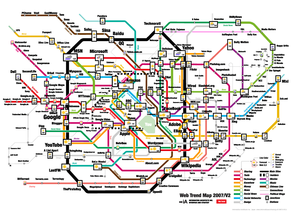
Recently I came across an article that showed many different interesting approaches to data visualization. I enjoyed it because it opened my eyes to more than just Google motion charts or geographical heat maps. Its strange to think how creative you can get with mass quantities off data and how visually appealing you can make it. The first one on the list shows a mind map of the 200 most successful websites on the web ordered by category, proximity, success, popularity and perspective by informationarchitects.jp.
This mind map is very intricate and fun to follow all of the different category paths. Some other visualizations use themes of larger items having more significance like we have seen before on some TED talks. I have always been intrigued by geographical maps. Below is a map Time Magazine developed to show the population density throughout the United States. They used visual spikes to denote high population densities.
I find this visualization is more effective in showing the drastic differences in population density rather than just having a scale of green to purple on a flat map. I think its safe to say that New Yorkers don't have a whole lot of space to their selves. This article by Smashing Magazine has many other interesting visualizations. I hope these provide some inspiration for anyone that wants to make some cool visualizations. Below is the link to the article.
http://www.smashingmagazine.com/2007/08/02/data-visualization-modern-approaches/


This is a compelling perspective on data visualization, especially in showing how creative visual design can transform complex datasets into clear and engaging insights. The examples demonstrate that effective visualization is not simply about presenting data, but about revealing patterns, relationships, and differences in ways that make information easier to understand and remember. A valuable reminder that thoughtful design can significantly enhance the impact of big data analysis.
ReplyDeleteشركة العناصر المتطورة للمقاولات
GREAT
ReplyDeleteThis topic focuses on presenting departmental data in a clear and understandable way to Sister Margaret from France. It involves organizing important information such as department activities, performance, statistics, achievements, resources, and other relevant details into tables, charts, graphs, or presentation slides.Data Analytics Training. The main purpose is to communicate the data accurately and make it easy for the audience to understand the department’s performance and key findings. Effective data presentation should use simple language, appropriate visualizations, clear headings, and accurate figures so that the information can be understood easily by an international audience.
ReplyDelete