Our visualization project is a model showing the internet users across the globe from the time period 1997-2011. We have categorized the usage based on some research regarding usage split up, peaks and so on. This type of model might be important to say a service provider company such as AT&T,Charter, Vodafone etc to develop business models and predict growth for the next few years. we learned how to implement this using Google Spreadsheet. Although this tutorial is short and can only show so much this model can be used to analyze various forms of data draw various comparisons. The video starts from 0:17.
Showing posts with label Tutorial. Show all posts
Showing posts with label Tutorial. Show all posts
Wednesday, February 27, 2013
GapMinder Video Tutorial
Here is a video tutorial for using the GapMinder World software. It's free to download and pretty easy to use but I just wanted to show a view things it can do.
Tutorial: How to create a animated map
Our visualization project is due tomorrow, and I think this tutorial will help people who is still struggling with create a map. I use my project as the example, and the software I use is Tableau trial version.
First, and the most important part is to download tableau 7.0 from the website. Without this software, this tutorial is just a trash. Next, let us go forward to the guide of each step.
Step 1: Import data from any the file you want to take a look at. If you want to import data from Excel, you can import multiple sheets or one single sheet.

Step 3: There is a variable called "measure values" at the left down corner. It contains all variables that you want to measure or plot. Drag that to "Level of Detail". Once you do that, you can see the variables below that box. You can change the properties by yourself.


First, and the most important part is to download tableau 7.0 from the website. Without this software, this tutorial is just a trash. Next, let us go forward to the guide of each step.
Step 1: Import data from any the file you want to take a look at. If you want to import data from Excel, you can import multiple sheets or one single sheet.

Step 2: If your data contains address, tableau will automatically generate longitude and latitude. Drag longitude to columns, and latitude to rows, or you can just click "dimension" at the left upper corner.

Step 3: There is a variable called "measure values" at the left down corner. It contains all variables that you want to measure or plot. Drag that to "Level of Detail". Once you do that, you can see the variables below that box. You can change the properties by yourself.
Step 4: Then drag the variable that you want to show on the map to "Colors" under "Marks". If you want to show the yearly trend, drag the years to "pages". Wait a minute!!! But I have multiple variables that I want to show them on the map. What should I do? Don't worry. It is step 5.

Step 5: If you want to show multiple variables on the same page, then drag longitude or latitude again depends on how many variables you have. After you finish it, you can choose multiple marks. Set different variables to different colors, then you can have a pretty good animated map.

Tuesday, February 26, 2013
Monday, February 25, 2013
Visualization Tutorial
Visualization Model
This tutorial shows how to setup a visualization model using Google spreadsheet. I thought since this week is the deadline to turn in the project I will go ahead and share what our team did for our visualization project. This develops a model for the Internet Users (per 100 people) across the globe over a mentioned time frame. For our project submission we made a few more enhancements, but this video tutorial shows how to implement a motion chart with a certain data set using Google Spreadsheet.
references: Google Tableau/Gallery Datasets
Right Wing??? Left Wing??? Independent???
Right Wing??? Left
Wing??? Independent???
Have you ever wanted to know what
party affiliation your favorite news agency had? Have you ever thought that one
news agency is slanted to the left or the right? Have you had arguments with
coworkers, friends, or family about whether or not their favorite station is biased
or not? Well, now you can utilize the analysis of big data and text mining to
prove your theory or debunk theirs!
The method of implementation is fairly
simple. Firstly collect tweets from the stations that are in question, ensuring
that they are from the same time frame. This can be done by copying and pasting
it into an Excel spreadsheet. Now using a program to text mine you can count
the frequency of individual words and create word associations. I used Rapid
Miner to analysis my data. There are several tutorials on the internet that can
walk you through that process. When doing this analysis one must be sure to
look at the word associations. So that you can see what context the most
frequent words were spoken in. For example whether it was a pro-Obama statement
or not or whether it was a pro-gun control statement or not. This is key, in
understanding the political biased of a news agency. Now for a quick example!
In this example I looked at CNN,
Fox News, BBC International, and NPR. Here are some of the tables I created
from the gathered data.

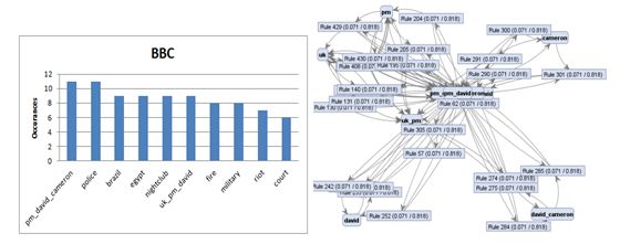


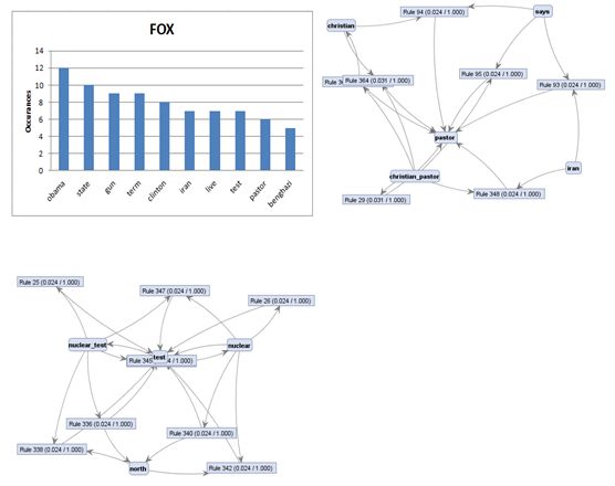
From the analysis I found many interesting
things. Mainly, that there is a large difference in the stories that news agencies
report and that they tend to be biased towards the political parties that they
are affiliated with. CNN and NPR tend to have more left wing topics with NPR
not being quite as far left as CNN. FOX tends to be more right wing in their
topics. BBC seems to be the most independent station that I analyzed. There are
a finite number of active stories in world news and one would think that all
news agencies would report on them relatively equally. This has not been the
case with the data I have analyzed.
Sunday, February 24, 2013
Geocoding using Google Fusion Tables
Lets say that you are looking at data that involves people from multiple locations and you are trying to find if there are any areas that have larger volumes of interest or representation in you data set. One very important way to analyze or visualize this kind of data is to map it.
Google has created a new way of mapping data, or geocoding, using there cloud based Drive platform. The following will be a tutorial on how to input the data and then geocode data onto a map of the United States using Fusion Tables, but the process can be done over a small area, say a city or sate, in the same way. (Below is a representation of the outcome we want to achieve. Each of the red dots represent a data point, in this case 160.)

The first step is to get a data set that contains the information that you want to view and the location of the data points. It is important that the location of the data points is contained in its own column of an excel style spreadsheet. Later you will see that the location must be in a column by itself because the fusion table will automatically geocode based only on this column. The photo below shows the data set that I will be geocoded.
 The next step is to log into Google Drive (Most well know this as Google Docs). Click on "Create" and choose "Connect More Apps". Because Fusion Tables are new to Google Drive, this app well need to be added. Once the app has been added, click "Create" and then choose "Fusion Table". A dialog box will open allowing you to import your data. In my work with fusion tables, it never allowed me to import data from a Google spreadsheet but it did import from Excel without problem.
 Once the data has been imported, it well open up to a table like the one below.

The next step is to have the program geocode based on the column that has the location of each data point. Select "File" and then "Geocode". This well open a dialog box like the one below. Select the appropriate column and click "Start". Geocoding can take a long time depending on the number of data points that you wish to geocode.
 Once the geocoding is complete, you can select the Map tab at eh top of the table and view the map.
Below is a table that I created that contains over 9,600 data points.

The stacking of data points can be seen here give some indication of imtensity.

One of the cool things that these Fusion Tables allow you to do is drill down into a smaller region in the same data sets. The picture below is a zoomed in view of the state if California.

And going even further, the area of Los Angles.

This link well allow you to view the map that I created: https://www.google.com/fusiontables/embedviz?viz=MAP&q=select+col0+from+1OVPgb3sIiVTwsm2kbf3SuzjRmDNW3S3lkN3asCk&h=false&lat=33.642559455929344&lng=-117.6455234375&z=9&t=1&l=col0&y=2&tmplt=2
This link is a blog entry that shows how one website used Fusion Tables to map Bicycle Trails:http://blog.mtbguru.com/2010/02/24/mtbguru-tracks-as-seen-through-google-fusion-tables/
Google has created a new way of mapping data, or geocoding, using there cloud based Drive platform. The following will be a tutorial on how to input the data and then geocode data onto a map of the United States using Fusion Tables, but the process can be done over a small area, say a city or sate, in the same way. (Below is a representation of the outcome we want to achieve. Each of the red dots represent a data point, in this case 160.)

The first step is to get a data set that contains the information that you want to view and the location of the data points. It is important that the location of the data points is contained in its own column of an excel style spreadsheet. Later you will see that the location must be in a column by itself because the fusion table will automatically geocode based only on this column. The photo below shows the data set that I will be geocoded.


The next step is to have the program geocode based on the column that has the location of each data point. Select "File" and then "Geocode". This well open a dialog box like the one below. Select the appropriate column and click "Start". Geocoding can take a long time depending on the number of data points that you wish to geocode.

Below is a table that I created that contains over 9,600 data points.

The stacking of data points can be seen here give some indication of imtensity.

One of the cool things that these Fusion Tables allow you to do is drill down into a smaller region in the same data sets. The picture below is a zoomed in view of the state if California.

And going even further, the area of Los Angles.

This link well allow you to view the map that I created: https://www.google.com/fusiontables/embedviz?viz=MAP&q=select+col0+from+1OVPgb3sIiVTwsm2kbf3SuzjRmDNW3S3lkN3asCk&h=false&lat=33.642559455929344&lng=-117.6455234375&z=9&t=1&l=col0&y=2&tmplt=2
This link is a blog entry that shows how one website used Fusion Tables to map Bicycle Trails:http://blog.mtbguru.com/2010/02/24/mtbguru-tracks-as-seen-through-google-fusion-tables/
Friday, February 22, 2013
Visualization Importance and How-To in Orange
Importance
Now that we know a little bit about how to mine data, we
need to know how to interpret it. Our course name is “Analytics and
Visualization of Big Data”. While we now know a little bit about how to analyze
big data, it is important that start thinking about how to visualize it,
especially with our visualization project coming up!
There are so many products out there that assist in
analyzing data visually. I feel like so many people claim to be “visual
learners” and that makes sense. Our brains are naturally good at visual
analysis. One study even estimates that the optic nerve that sends data to our
brains operates at 9Mb/sec. Visualizing data is key in giving us knowledge
quickly, efficiently, and effectively. Being able to present data in a way that
is appealing to the eye not only helps the analyzer to understand the data they
are mining, but also helps other people (who aren’t as smart to understand all
that we do) to get the big picture.
I will post a few screen shots about how to visualize one
data set in two different ways using Orange data mining software. Maybe this
quick tutorial will show you how to quickly analyze some data you might have!
I know that Patrick showed us in class how to use Orange,
but this tutorial mainly goes to show that the same data can be viewed in a
different light depending on the visualization tool that you choose to use. (I
will even use the same animal data set that we did in class.)
File:
--First you need to load a file for Orange to read
information from. From the Data
tab, drag and drop the ‘File’ icon. Double click the ‘File’ icon to search for
a file. The file used here will be called ‘zoo.tab.tab’.

Attribute Statistics:
--Next, go to the Visualize tab. The ‘Attribute Statistics’
icon will allow you to see basic statistics about the data. Drag and drop this
icon to the window and draw a line between the ‘File” icon and the ‘Attribute
Statistics’ icon. Double click on the icon to see the attribute statistics.

Scatterplot:
--A scatterplot would be my first choice of a way to visualize
data because it is something that I am familiar with. Drag and drop the
‘Scatterplot’ icon and draw a line between ‘File’ and ‘Scatterplot’. Double
click the icon to see the plot. You are able to choose what attributes are for
the x-axis and y-axis. In this case, I chose to observe fins vs. eggs.

Mosaic Display:
--Another visualization tool is a mosaic display. I didn’t
really know how this worked before playing around with Orange, but it’s pretty
cool. Drag, drop, and connect the ‘Mosaic Display’ icon to the ‘File’ icon just
as before. Again, I want to compare fins vs. eggs. The chart might look
overwhelming at first, but if you roll your mouse over a certain area, it shows
details of what the color blocks are representing.

Scatterplot vs.
Mosaic Display:
I chose for each of these visualization tools to represent
the same attributes. For both of these, the colors represent the type of
animal. So when you compare the two, the colors look like they are in similar
areas. However, I find that the Mosaic Display shows the information much more
clearly than the Scatterplot does. There are so many dots in the same spot on
the scatterplot that it is hard to understand what they all mean. I encourage
you to play around with these tools to see what works best for your data set.

These are just a couple of ways to visualize the same data.
There are so many options within the Orange program to visualize data. Not to
mention, there are so many online tools that can be utilized. I would love for
someone to do a tutorial on another program that I could learn to use! It is so
important that we all understand the different visualization methods!
Sources:
Own a small business? Big Data can help.
Own a small business? Big Data can help.
Often when big data is discussed it is associated with large corporations such as Facebook or Twitter using it to better meet the needs of their customers. This makes many people think that big data analysis is only for big businesses which is simple not true. No matter how small your company is big data analysis can help you rise above your competition in all aspects of your company. This blog is intended to provide some of the ways you can use big data analysis to help your business become better.

If interested about how big data
could help your small business check out some of the following websites for a
little more information:
Sunday, February 17, 2013
Hadoop Distributed File System
Hadoop Distributed File System
In the past, applications that called for parallel processing, such as large scientific calculations, were done on special-purpose parallel computers with many processors and specialized hardware. However, the prevalence of large-scale web services has caused more and more computing to be done installations with thousands of compute nodes operating more or less independently. It was initially done with the Google File System (GFS) in order to successfully exploit cluster computing. The Hadoop Distributed File System (HDFS) is a subproject of the Apache Hadoop project. It is a distributed, highly fault-tolerant file system designed to run on low-cost commodity hardware. HDFS provides high-throughput access to application data and is suitable for applications with large data sets. Hadoop is ideal for storing large amounts of data, like terabytes and petabytes, and uses HDFS as its storage system. HDFS lets you connect nodes (commodity personal computers) contained within clusters over which data files are distributed. You can then access and store the data files as one seamless file system. Access to data files is handled in a streaming manner, meaning that applications or commands are executed directly using the MapReduce processing model. HDFS is fault tolerant and provides high-throughput access to large data sets. HDFS has many similarities with other distributed file systems, but is different in several respects. One noticeable difference is HDFS's write-once-read-many model that relaxes concurrency control requirements, simplifies data coherency, and enables high-throughput access. Another unique attribute of HDFS is the viewpoint that it is usually better to locate processing logic near the data rather than moving the data to the application space. HDFS provides interfaces for applications to move them closer to where the data is located. HDFS can be accessed via so many different ways. HDFS provides a native Java application programming interface (API) and a native C-language wrapper for the Java API. In addition, you can use a web browser to browse HDFS files. This is a big advantage as it provides portability to the application. The following video takes us through a tutorial about the architecture of the Hadoop Distributed File system (HDFS). HDFS has many similarities with other distributed file systems. But a unique feature of this model is that it is a simplified in terms of data understanding and is capable of handling larger volumes of data. It also employs a form of logic where data is stored in parallel nodes, which is easy to access via the process node. The architecture comprises of a name node and a process node with data distributed on 2 servers with multiple stacks. This accommodates for processing larger data sets and it works well with the logic model employed to search for replicated data. The data replicas are stored in various name nodes to ensure redundancy. A data set which is split into blocks for processing in clusters is typically in the size of 64MB to 128MB.A secondary name node cannot take over if the primary name node fails. Data is replicated periodically and it can be reconstructed by using a certain logic and can be accessed via the secondary name node. It is optimized for batch processing and it assumes commodity hardware. References: Jeff Hanson-An Introduction to Hadoop Distributed File System http://www.ibm.com/developerworks/library/wa-introhdfs/ Dr. Sreerama K. Murthy-International School of Engineering
Friday, February 15, 2013
An example of Apriori algorithm
This tutorial/example below would help
you understand the Apriori algorithm. Let us consider a simple example of the
items being purchased at a store with different transaction ID and find out the
frequently bought items at the store.
Let us set the support threshold to be
3.
|
Transaction ID
|
Items Bought
|
|
T1
|
{Mango, Onion, Nintendo, Key-chain, Eggs, Yo-yo}
|
|
T2
|
{Doll, Onion, Nintendo, Key-chain, Eggs, Yo-yo}
|
|
T3
|
{Mango, Apple, Key-chain, Eggs}
|
|
T4
|
{Mango, Umbrella, Corn, Key-chain, Yo-yo}
|
|
T5
|
{Corn, Onion, Onion, Key-chain, Ice-cream, Eggs}
|
So for here it should be bought at
least 3 times.
For simplicity
M = Mango
O = Onion
And so on……
So the table becomes
Original table:
|
Transaction ID
|
Items Bought
|
|
T1
|
{M, O, N, K, E, Y }
|
|
T2
|
{D, O, N, K, E, Y }
|
|
T3
|
{M, A, K, E}
|
|
T4
|
{M, U, C, K, Y }
|
|
T5
|
{C, O, O, K, I, E}
|
Step 1: Count the
number of transactions in which each item occurs, Note ‘O=Onion’ is
bought 4 times in total, but, it occurs in just 3 transactions.
|
Item
|
No of transactions
|
|
M
|
3
|
|
O
|
3
|
|
N
|
2
|
|
K
|
5
|
|
E
|
4
|
|
Y
|
3
|
|
D
|
1
|
|
A
|
1
|
|
U
|
1
|
|
C
|
2
|
|
I
|
1
|
Step 2: Now remember we
said the item is said frequently bought if it is bought at least 3 times. So in
this step we remove all the items that are bought less than 3 times from the
above table and we are left with
|
Item
|
Number of transactions
|
|
M
|
3
|
|
O
|
3
|
|
K
|
5
|
|
E
|
4
|
|
Y
|
3
|
This is the single items that are
bought frequently. Now let’s say we want to find a pair of items that are
bought frequently. We continue from the above table (Table in step 2)
Step 3: We start making pairs
from the first item, like MO,MK,ME,MY and then we start with the second item
like OK,OE,OY. We did not do OM because we already did MO when we were making
pairs with M and buying a Mango and Onion together is same as buying Onion and Mango
together. After making all the pairs we get,
|
Item pairs
|
|
MO
|
|
MK
|
|
ME
|
|
MY
|
|
OK
|
|
OE
|
|
OY
|
|
KE
|
|
KY
|
|
EY
|
Step 4: Now we count how many
times each pair is bought together. For example M and O is just bought together
in {M,O,N,K,E,Y}
While M and K is bought together 3
times in {M,O,N,K,E,Y}, {M,A,K,E} AND {M,U,C, K, Y}
After doing that for all the pairs we
get
|
Item Pairs
|
Number of transactions
|
|
MO
|
1
|
|
MK
|
3
|
|
ME
|
2
|
|
MY
|
2
|
|
OK
|
3
|
|
OE
|
3
|
|
OY
|
2
|
|
KE
|
4
|
|
KY
|
3
|
|
EY
|
2
|
Step 5: Golden rule to the
rescue. Remove all the item pairs with number of transactions less than three
and we are left with
|
Item Pairs
|
Number of transactions
|
|
MK
|
3
|
|
OK
|
3
|
|
OE
|
3
|
|
KE
|
4
|
|
KY
|
3
|
These are the pairs of items frequently
bought together.
Now let’s say we want to find a set of
three items that are brought together.
We use the above table (table in step
5) and make a set of 3 items.
Step 6: To make the set of
three items we need one more rule (it’s termed as self-join),
It simply means, from the Item pairs in
the above table, we find two pairs with the same first Alphabet, so we get
· OK and OE, this gives OKE
· KE and KY, this gives KEY
Then we find how many times O,K,E are
bought together in the original table and same for K,E,Y and we get the
following table
|
Item Set
|
Number of transactions
|
|
OKE
|
3
|
|
KEY
|
2
|
While we are on this, suppose you have
sets of 3 items say ABC, ABD, ACD, ACE, BCD and you want to generate item sets
of 4 items you look for two sets having the same first two alphabets.
· ABC and ABD -> ABCD
· ACD and ACE -> ACDE
And so on … In general you have to look
for sets having just the last alphabet/item different.
Step 7: So we again apply the
golden rule, that is, the item set must be bought together at least 3 times
which leaves us with just OKE, Since KEY are bought together just two times.
Thus the set of three items that are
bought together most frequently are O,K,E.
Subscribe to:
Posts (Atom)